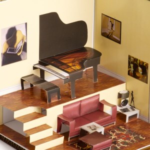
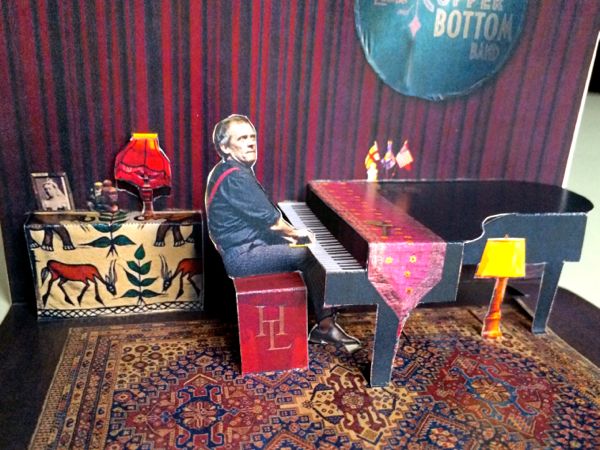
 Photo pop-up cards are pop-ups which use photographs as an important part of their design. All the rooms in the pop-up paper house, the pop-up piano, but also the camel are photo-realistic pop-up cards. Citifield, on the other hand, is not a photo-realistic card, because most of it was hand drawn and colored; the only photograph used in Citifield is the one on the jumbotron.
If you would like to design a photo realistic card, first you must master pop-up design basics, then you must understand that not all photographs can be used to create a pop-up card.
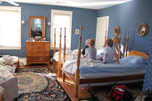 The snapshot of a bedroom on the left, for example, gives a good sense of the space but because of the lighting and angles it cannot be used to create a pop-up. To make a pop-up card of this room you would need dozens of photographs, a couple for each separate element, each picture, piece of furniture, light and accessory, and they all need to be taken straight on, from the side and from above. The photos below are suitable for designing a photo pop-up card: they don’t have any objects or people obstructing the image, and they are taken from a straight 90° angle. Each element can be cut out, edited, then placed in your design.
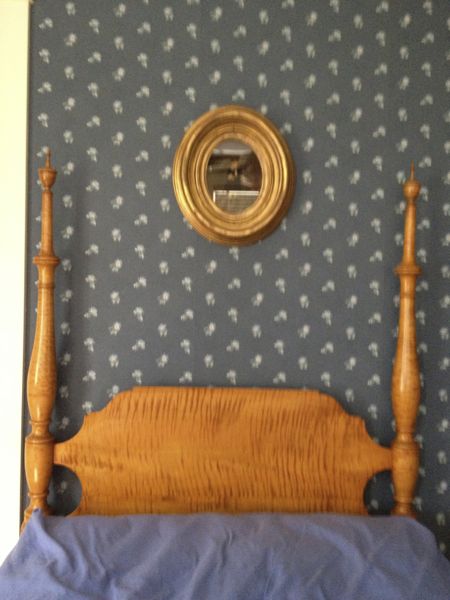
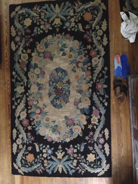
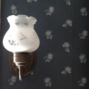
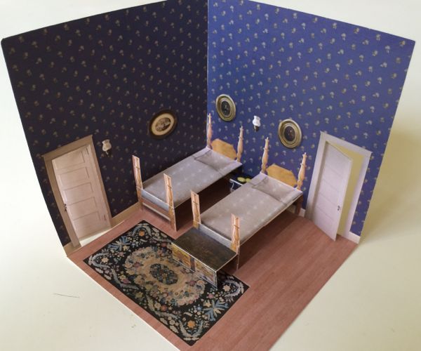
A pop-up card of a real space will always be an interpretation of the space, not an exact replica. Given the restrictions of scale and the strength of the paper you use, the paintings and wall paper pattern might be bigger than those in the real space, the furniture might have to be moved around, or even modified. The bedposts above, for example, are much wider than those on the real bed; they would have been too fragile if I’d kept the same proportions.
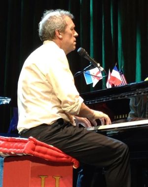
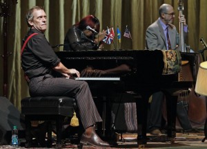
If you want to incorporate photos of people in your card the same restrictions (the right angle and unobstructed views) apply.

You must be logged in to post a comment.